Legendary Strategies To Driving Dollar Webinar Registrants Revealed
An Eight-Step Formula for Webinar Ads that Really Work—and keep your investment costs low
It’s possible to make a million dollars overnight.
Marketing guru Frank Kern’s biggest launch to date generated more than $18.3 million dollars in a single day.
Dan Henry, a popular Facebook marketer, made more than a million dollars in 24 hours using the same few webinars.
For both marketers, webinars are a top lead generating tool. The ads they use to get people to sign up for the webinars are equally important for lead generation. It’s where their digital marketing efforts really begin.
In the Clickfunnels community, Henry recently posted that one webinar ad he runs gets him registrants for $0.80-$1.50 each.
That’s not a bad investment when you’re selling high-end services like coaching packages or effective video courses.
It’s also not the norm.
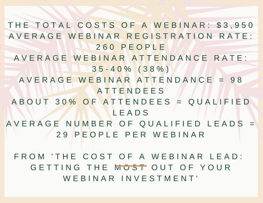
The cost of webinar ads isn’t cheap. To get a return on investment, most webinars have to invest around $52 for each qualified lead that these webcasts generate. This makes what Kern and Henry are doing with their virtual marketing really stand out.
What the Ads from These Marketers Have in Common
The aim of this article is to teach you how to attract webinar registrants using the same techniques that Kern and Henry use.
We’ll be breaking down successful ads from both of these marketers. You’ll see how to create a killer webinar ad that gets high quality webinar registrants for low prices—but first, what is a webinar click funnel?
What is a webinar click funnel—and why is it important?
In the digital marketing world where you’re marketing events like webcasts, a click funnel is a sales funnel.
For example, someone sees an ad for an event marketing webinar and clicks on it. The next step for the prospect is signing up for the webinar, where you can upsell your product or service.
In virtual marketing, making the conversion process as easy as possible for the prospect is one of the most important pieces of the lead generation process.
The more you can keep a lead clicking, the higher your chances are that the lead will eventually convert to a sale.
Designing your webinar ads to draw people into your click funnel is actually the second step. Understanding how it’s done is the first step, and we’re jumping into that topic now.
Eight components of a bulletproof webinar ad
Both Kern and Henry use eight components in their webinar ads to make them effective. I’m listing them here, and then we’ll go through the ads bit by bit to illustrate the points.
- Speaking directly to your perfect customer: even in virtual marketing, since you’re selling to a targeted group of people, you need to address them as though you were holding a face-to-face conversation with them.
- Speak to their current pain point: you’ll need to do your research to know what the pain points are and how to show empathy while providing hope and solutions.
- Tell your story: this is where you include your credibility and social proof. Show your customers that you know there’s a way out of the pain point because you’ve been through it and you’ve come out on top.
- What do you have? This is where you can list your product or service you’ll be talking about in the webinar and why the topic is important
- Who has benefited by taking action in the past? Address how the webinar topic has already helped people.
- Where they can take action and click on your offer: this is your call-to-action. Make it powerful.
- What they are missing out on if they don’t take action: this is a rephrasing of the ‘what do you have’ section, but kind of a reversal, too. Use this section to remind customers how their lives will be better if they watch the webinar, and how nothing will change if they don’t attend.
- Video or image that grabs your attention: adding a video to a webinar ad can increase its conversion rate by 80 percent. At the very least, you should include a relevant, engaging image in all your digital marketing to increase your lead generation.
Dissecting Two Ads
While both Kern and Henry use the same techniques, they have very different styles. Henry’s work is short and to the point. Kern writes longer copy that proves he cares and can provide meaningful solutions.
Both copy techniques can work when they include all eight elements.
The long and short of it: comparing techniques in ads from both Kern and Henry
With both ad types, you’ll be able to clearly see how these marketing masters create their ads using the same eight steps.
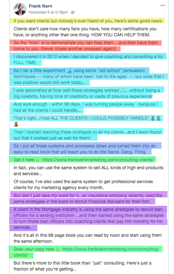
The ad images are color coded to differentiate between different elements. We’ll talk about those elements color by color as we go along, focusing on one ad at a time.
Frank Kern’s Ad
Page One
Yellow
The top line in this ad, which is highlighted in yellow, is where Kern is speaking to a specific audience. For this ad, he’s addressing business owners who are looking for more clients.
Red
The red highlighted section is where Kern speaks to a particular pain point. For this ad, the pain point is the need to chase prospects rather than having leads flow to your business.
When someone tells you they are going to solve one of your biggest problems in business, you’re naturally going to read more.
This is one of the most important components of event marketing, such as in a webinar ad. If you don’t speak to the pain point, your audience doesn’t have a reason a reason to continue reading.
Aqua
The section highlighted in aqua is where Kern tells his story. He does a great job of walking readers through his journey of success, beginning with where he first started and comparing it to where he is today.
Sharing a success story like this one allows business owners and marketers to naturally and automatically insert themselves in the story as the subject of success in a mirroring technique.
When Kern says he accomplished his goal with ease, they understand that they can, as well. It boils down to a situation where his story allows him to become a mentor for other people.
Blue
There is one line in the ad highlighted in blue. It’s difficult to see because it’s surrounded by aqua, but this blue line brings out the big picture. Kern is offering a formula of simple steps toward success that are collected in a book.
Purple
In the purple highlighted section of this ad, Kern mentions two other companies in two completely different industries that use his services. He does this as a demonstration of how his strategies can be applied to anyone and makes a point to show that other people have benefited from this in the past.
Green
The green section is a call-to-action where customers can click on your offer for the webinar. A CTA is included twice on the front page of this ad.
It’s important to make your links easily accessible. In a long ad like this, the reader may buy in before the end of the ad, and you’ll want to capture their buying power as soon as they do.
Page Two
Tan
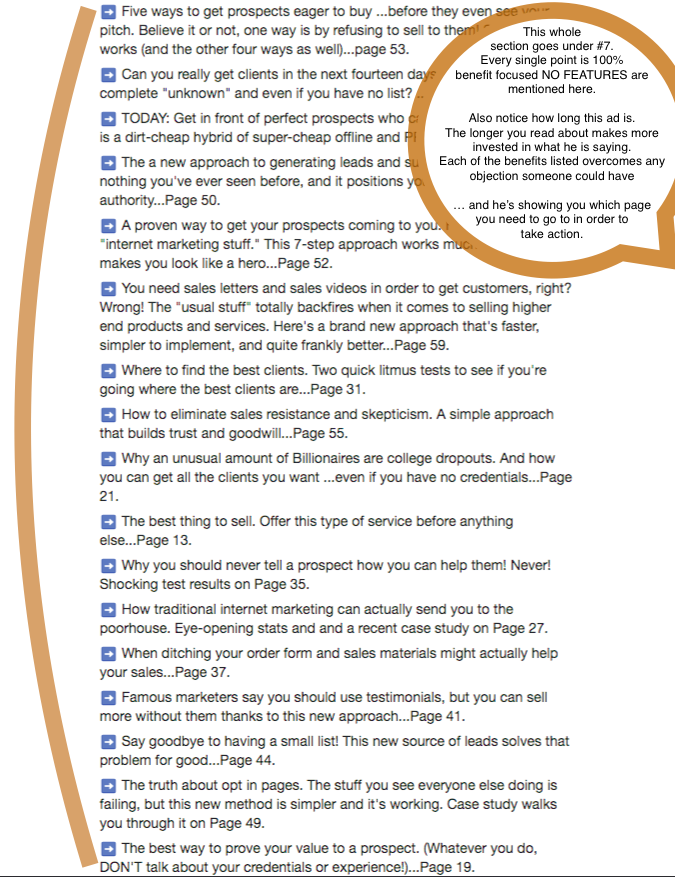
This ENTIRE section, which is marked with this tan color, is 100% benefit focused. By walking through each of these perks, Frank Kern eliminates reader’s objections and shows customers what they’ll miss out on if they don’t act on the CTA. This ad does a great job of qualifying Frank Kern’s audience before readers click and take action.
Page Three
Here’s the end of the ad from Frank Kerns using the same techniques.
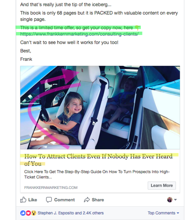
Notice how some of the elements from the beginning of the ad are repeated at the end of the ad. Once again, he’s speaking to his perfect audience and incorporating a call-to-action.
About 80% of people who see an ad look at the image and the headline first. Frank Kern’s headline is almost exactly the same as the first line in his ad.
He does that because it speaks directly to a business owner who’s seeking more clients. There is no better way to grab someone’s attention by speaking directly to them and covering one of their biggest struggles in business.
Kern also incorporated an engaging photo. There are a few reasons why this image immediately grabs your attention. The first thing is we see a child with her hands on the wheel of a Rolls Royce, one of the most expensive cars on the market worth over $200,000.
Subconsciously, this grabs our attention because most people have never been inside of a luxury car like that.
A Short Ad from Dan Henry
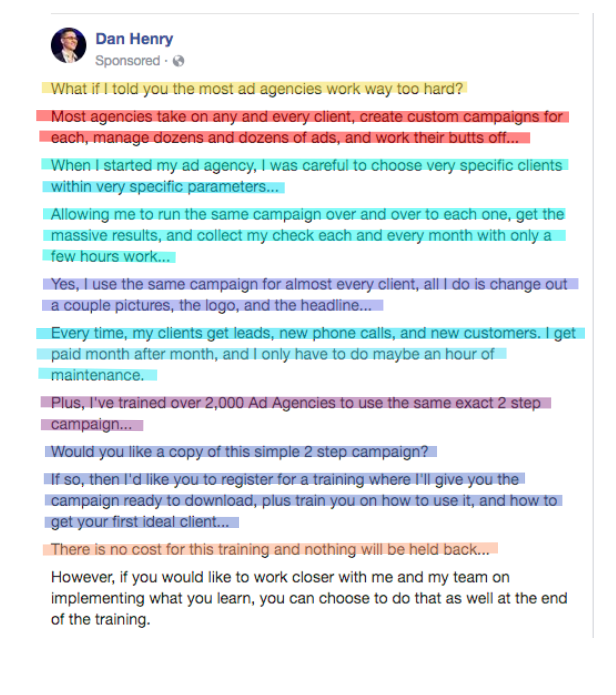
Although this webinar ad is much, much shorter, it’s also had excellent results. It’s currently generating webinar registrants at a cost of $0.80-$1.50 each.
As we walk through it, you’ll see the same elements that Frank Kern used in his ad. You don’t need a three page ad to use all eight components. As short as it is, this ad is very effective and generates a tremendous amount of cheap leads.
Yellow
In the yellow highlighted top line, Henry speaks directly to his perfect customer for this webinar: ad agents who work really hard.
Red
The red highlighted section is the pain point, which focuses on a need to take every client and work all the time.
Aqua
The aqua-colored story section briefly tells how Henry developed one campaign that can be used repeatedly in a variety of situations. Through mirroring-storytelling, he suggests that other ad agents can do the same thing.
Blue
The blue highlighted line tells what Henry is offering. For this ad, Henry says all you need is a simple two-step campaign that he can teach anyone to use in a webinar.
Purple
In the purple section, Henry says over 2,000 ad agencies have benefited from taking action on this webinar in the past.
CTA
The call-to-action is included at the bottom of the ad.
Tan
What they’re missing out on if they don’t take action: in the tan highlighted line, Henry says there’s a lot of information at no charge. Leads who don’t take action won’t get the two-step campaign, and they’ll miss out on the fact that it’s free, as well.
Video/Image
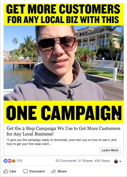
The large image near the bottom of the ad grabs your attention and makes you feel like you’re connecting with an overworked ad agent.
Expanding on the eight ideas: charging registrants for attending a webinar
If a webinar ad is designed effectively like this one from Dan Henry, a webinar host might be able to use the same formula to pull in paying registrants.
For example, Henry uses his two-step campaign as the focus of the webinar and then upsells online courses to the registrants. What if he charged a reasonable fee for the webinar? He could still use the webinar as a tripwire for his online courses, but he might make more money in the process.
Most tripwires cost between $5 and $50. If he could charge $5 per registrant and still get 100 registrants per webinar, he could make a profit on the event. It might be worth testing.
Putting it together: A side-by-side comparison
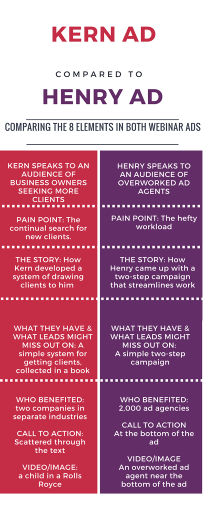
When you look at Kern’s ad next to Henry’s ad, the biggest difference is still the length. Both ads use the same eight components to create successful webinar ads that draw in leads with very small investments per lead.
Conclusion
Both Frank Kern and Dan Henry’s webinar ads have done very well. Length is the main difference. In a world where average attention spans are ten seconds long, it’s nice to know that shorter ads can be as effective as long ones.
The trick seems to be incorporating all eight components into your webinar ad. As you prepare your ad, check to make sure each element is in place.


