Why Building a Landing Page is important | JetWebinar Customized templates
Webinars can generate 3x more of your leads than you did before. Well, this is possible if you properly outlined, organized, and executed your webinar. But if you want to generate, and increase your conversion, you do need help with some great strategy that has the ability to do it. And that is the webinar landing page. So, let’s talk more about what is a webinar landing page and why building a landing page is important.

What are webinar Landing Pages?
Online events just like webinars should have enticing landing pages to attract and convert more visitors. The question now is do you know exactly what a webinar landing page is?
A webinar landing page is the main element of the conversion process. It is designed for a specific topic or campaign on your site to help you convert visitors into leads.
The webinar landing page is a one-page marketing website, this is similar to a flyer that allows the marketers to sell directly their product and service in a virtual environment.
What it does
The purpose of the webinar landing page is to capture prospects that can be your leads in the future. It is also to prepare your potential customers for the new product you are about to introduce and market to them.
The webinar landing page gives an offer and encourages the visitors to convert into leads. But creating landing pages requires focus, design, and knowledge about your target prospect.
Good to know, the landing page tool can help you build landing pages that convert leads.

What’s inside an effective Landing page?
Below, are the six elements that a landing page should have:
Unique Selling Proposition
Unique selling a proposition or known as USP defines what makes your product or company unique, different, and better than the other competitor. For example, Apple’s USP is they sell unique lifestyles that symbolize two characteristics: productivity and class.
USP should make your company special and why visitors should choose you among others.
RELATED ARTICLE: HOW DO YOU DRIVE BETTER CLIENT ENGAGEMENT AND EXPERIENCE?
Your picture or the host’s picture
Instead of using some downloadable picture from the internet that is not relevant and engaging to your business. Why not use your picture or perhaps your host’s and speaker’s picture when creating your post-click landing page.
This engaging, relevant, and captivating picture will help attract more visitors. Of course, who doesn’t like a good image? Be sure to add your company or your brand logo and a short bio of your guest’s speakers and hosts. It can be more effective.

The Benefits
Every visitor has their whats, whys, and hows when it comes to investing. Visitors wouldn’t dare to invest their time and watch your webinar if they will not get any benefits from it.
So you should highlight the benefits that every visitor will acquire in your webinar. You can also include some features of your webinar in detail.
It is more convenient for the visitors if they easily scan your webinar benefits and features into bullet points or lists.
Testimonials
Consumers are always looking for reviews, feedback, and testimonials of one product, brand, or service before taking any action, the same goes for landing pages. As testimonials are one of the simplest forms to have social proof to your visitors.
It is also one of the most important elements that visitors should see on your webinar landing page. Posting video and picture testimonials about your past attendees’ experiences on your previous webinar and even citing well-known authority sources that have given you good feedback are the ways to attain believable testimonials that will help you build a landing page more effectively.

Call to Action button
A CTA is an image or line text that encourages your visitors to take a specific action. CTAs are one of the effective and great ways to promote your landing page content.
The more your CTA resonates with the landing page the more people will convert. Hence, in building a landing page you should consider creating an eye-catching CTA and if possible make it more recognizable and visible.
Because most visitors or consumers on the internet are looking for quick information. It is better if you make your CTA button contrasting color that stands out from the rest. Concise information and details, big and readable font size and font color, and persuading text to make it easily recognized by visitors,
The lead capture form
The lead capture form on your webinar landing page should not be too long or ask a lot of information from your visitors. If not, there’s a chance they ignore and leave your landing page.
The more questions you ask your visitors to fill out a form, the lower chance you will close the sale. So it is better if you just keep your form brief and just get the most basic information like name and email address, this just for awareness purposes. But if it is necessary to have long-form just make sure it is not more than seven fields in your form.

Elements that you usually see in an effective Landing Page
Below are some elements that are usually seen as an effective and efficient landing page:
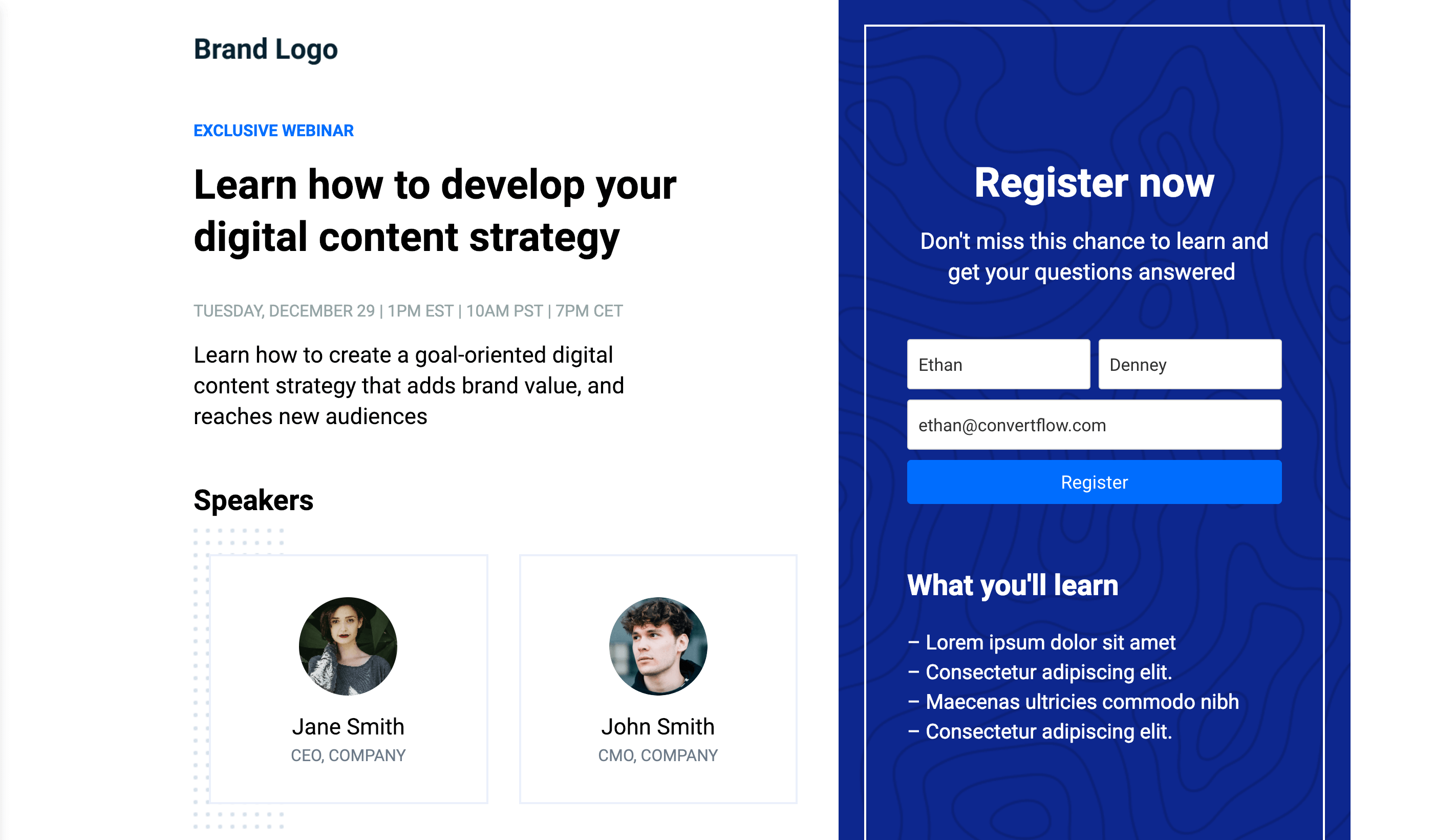
Straight to the Point
This element consists of a bold headline, a short intro paragraph, and even some bullet points to give the registrants the things they will expect. Your headline should give your visitors clear, concise straight to the point information or text and what exactly your webinar will offer to them.
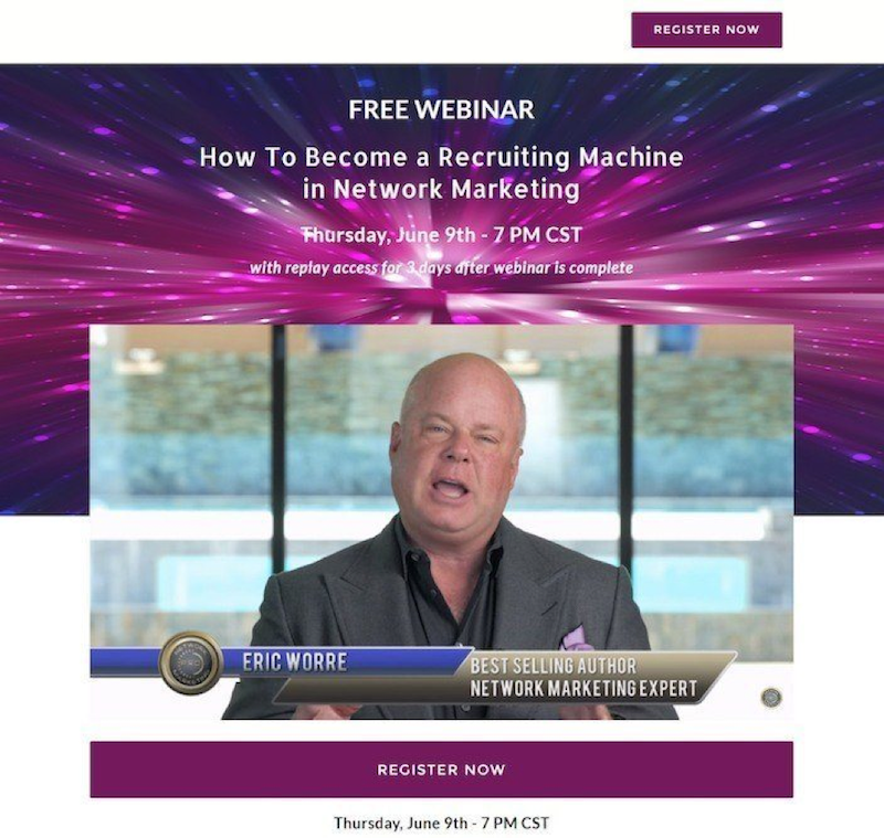
Content videos
This element uses a video, this video can be a clip from the previous sessions to give the users a clear picture or view of what they will expect or gain from the webinar. You can apply this if you want to send your visitor’s information or a message without getting them bored by reading a long text. Including a video on your webinar landing page can be a powerful and effective way.
RELATED ARTICLE: REVENUE MARKETING AND DIGITAL EVENTS THIS 2020 | WHY IS IT BENEFICIAL
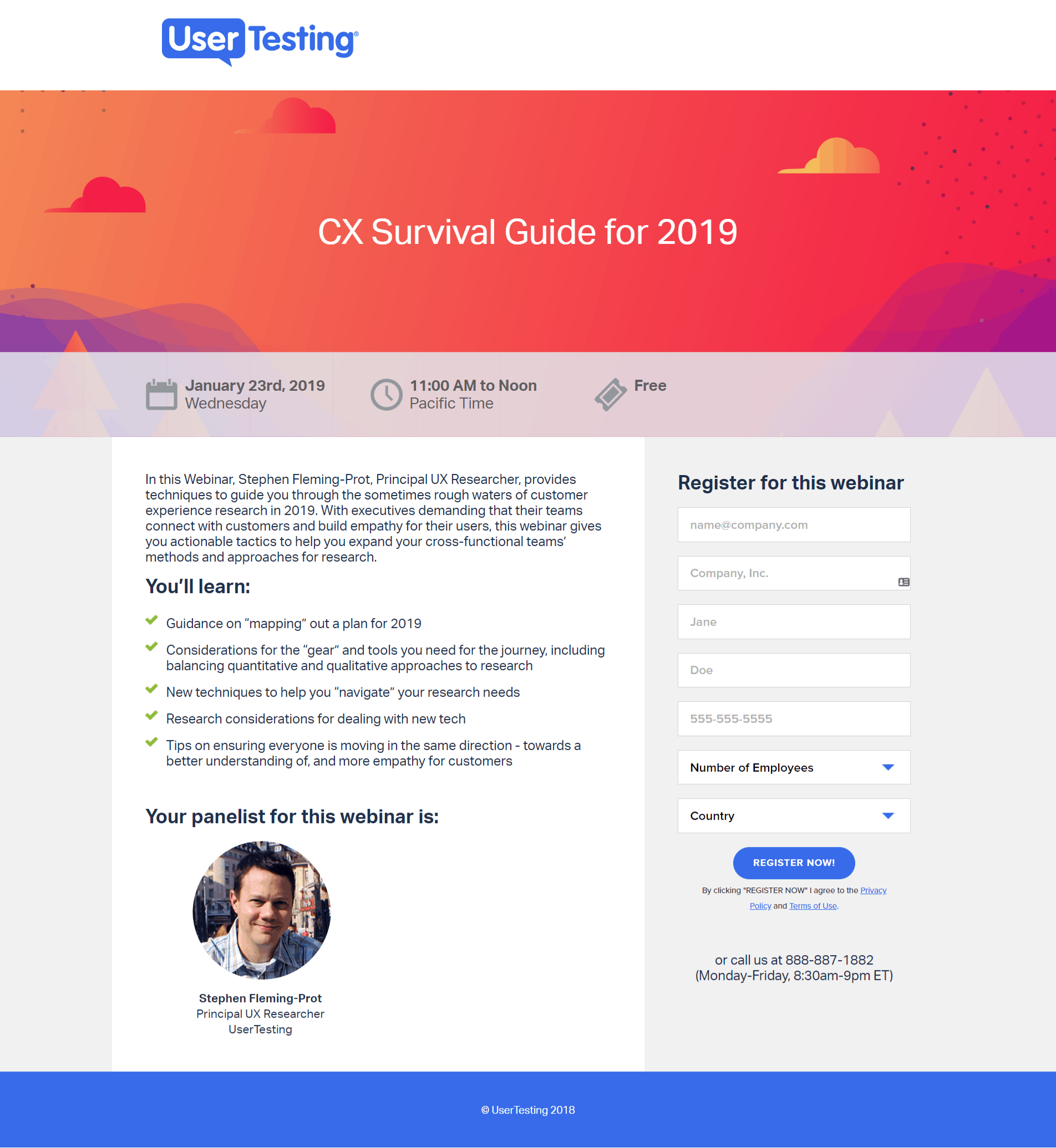
Outlined objectives
This element should appeal that there’s a clear and powerful plan. Outlined objectives is a short sentence in every bullet. Your objectives should deliver clearly and concisely. You can present this by using bullet points wherein it will keep your reader stay engaged and interested while giving them the details of what your main objectives are. What they can acquire from your webinar and eventually attract them to convert into a consumer.
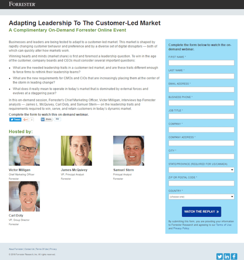
Qualified lead collector
This element includes collecting data, information about the person who shows interest in your company, brand, or service. For you to attract more visitors your landing page should have well-designed schemes and graphics pages.
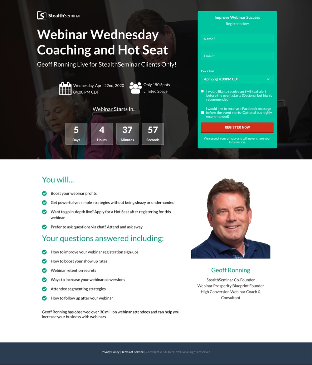
Highlighted outcome
This element needs to highlight its desired outcomes for their webinar. What can be a marketer’s desired outcome? It can be to fulfill what the customer needs and wants to achieve and help them find an answer or way to achieve their desired outcome. These said desired outcomes should be highlighted.
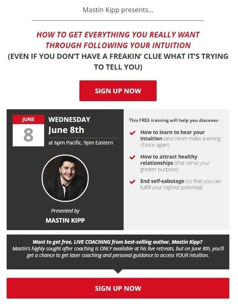
Don’t miss out!
This element uses an intriguing headline. Using the language “Don’t miss out!” implies that something is important you don’t need or want to miss. That is why visitors usually find it on the landing page, and perhaps it is an effective word to catch them. Because of these words, visitors attempt to do an action immediately for fearing missing out on something valuable and beneficial to them.
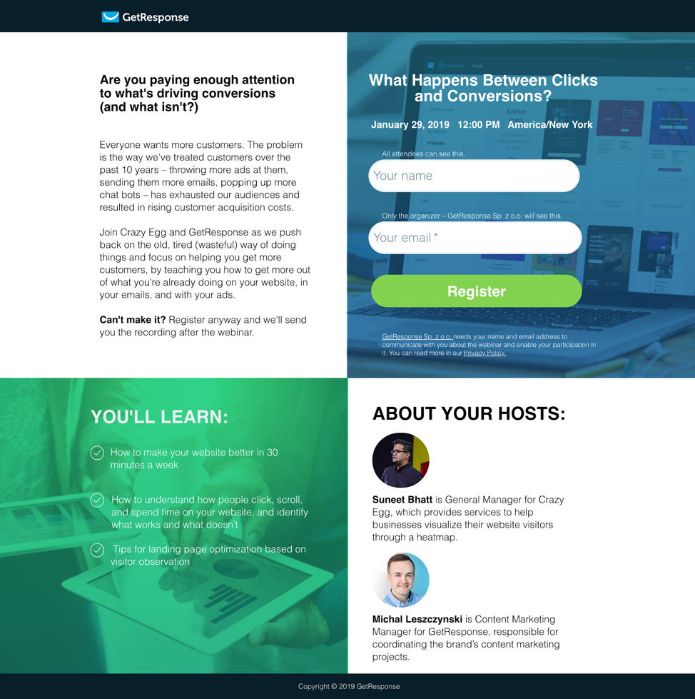
Focused on pain points
This element is designed to provide your visitors not only their needs and wants to know but rather a solution to their problems and concerns. You need to focus on the pain points or the reason why visitors should attend your webinar. You must provide them a useful and relevant answer to their problems, give their needs, or satisfy their wants.
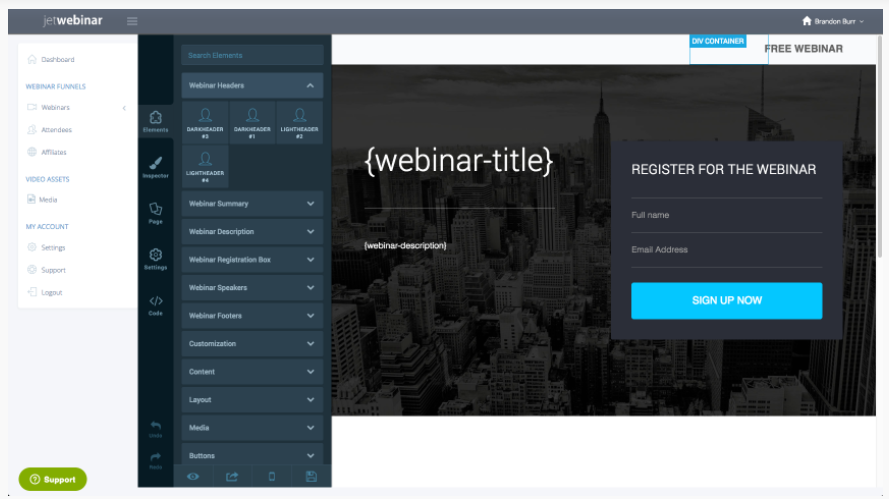
JetWebinar Customized Landing page
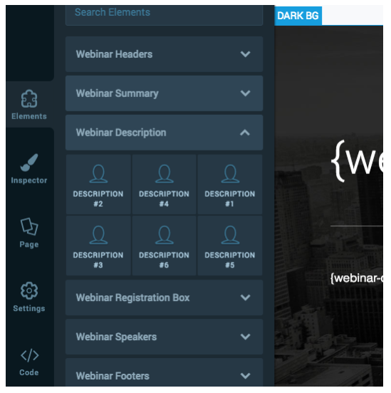
JetWebinar has a landing page builder feature wherein it allows you to customize every aspect of your webinar. You can create a custom registration page, thank you page, and even webinar room tab using its various types of colors, images, videos, layouts, templates, countdown timers, and many more.
You can make it any way you want or have to imagine it and will match your brand or product. JetWebinar, allows you to make your most amazing brand experience with the combination of the powerful drag and drop tool editor built into its software.
Not only that, but JetWebinars also have this powerful HTML/CSS customization tools. Everyone has the potential to use full HTML/CSS customization features, either its marketing team or development team as long as they need it.
Registration page
The registration page or also known as the sign-up page is the page wherein users register and acquire access to your system. The registration page tab allows you to customize your webinar registration page appearance and display.
Steps:
- Select the video to be uploaded.
- Choose the number of timeslots to be displayed for the webinar registration.
- Click the “Show Watch Replay” and then check the box if you want to attend and watch the webinar immediately.
- Click “Watch Replay Only” and then check the box to attend and watch the webinar immediately during the registration.
- In the Webinar, the Description box enters a text to be displayed on your webinar registration page.
- In the Presenter box, enter the name of the host.
- Click “Upload Custom Image” to upload an image to be displayed in your webinar registration page.
- Click “Choose File” to choose the location on your computer, and then click “Open” to upload.
- Click “Use Default Placeholder Image” to select the default image.
- Click “Use Custom Hosted Image URL” to enter the website link to the image displayed on the registration page.
Thank you page
The Thank you Page is a page wherein you redirect immediately your customer after they submit their information and other details in your opt-in form or make a purchase on your website. Thank you page allows you to upload a thank you video file.
Step:
Click “Upload Your First Video” to select a video to be displayed on your thank you page.
Webinar Room Tab
The Webinar Room Tab is a tab wherein you can customize a presentation of your Webinar. The Webinar Room tab allows you to change the settings of your webinar.
Steps:
- Select a video to be shown during your webinar.
- In Webinar Video Length, enter the hours, minutes, and seconds of your video duration.
- In Video Width/Height enter the width and height of your video.
- Click “Handle Late Visitors” and then check the box to give another set in handling late coming visitors.
- In Late Visitor Threshold, select the specific hours, minutes, and seconds to be considered late
- In Late Visitor Action, select action to be applied after the threshold time,
- Actions can be:
- Show Latte Visitor Video, you can choose a video to be displayed to the late participants.
- Show Late Message, you can enter a message to be displayed to the late participants, or
- Redirect URL, you can enter the website to be displayed to the late participants.
- Actions can be:
- In Display on Completion, select content to be displayed on completion of the webinar event.
- In Webinar Completion Message, enter a message to be displayed to the attendees after your webinar event.
- In Redirect to Replay Page, it will be replayed again.
- In Redirect to URL, enter a website to be displayed after the webinar.
- In Missed Webinar Action, select content to be displayed to your participants who arrive after the completion of your webinar.
- In Missed Webinar Message, enter a message to be displayed to your participants.
- In Basic Sales Copy, enter a message to be shown to attendees
- In Call to Action, select an image to be shown on the button.
- In Target URL, enter the website to be displayed on the button-click of your webinar.
- In Show Button At, enter the specific hours, minutes, and seconds to be shown after the webinar starts.
- In Show Button For, enter the specific hours, minutes, and seconds for the button to be shown.
- In Sales Cop, enter any additional messages or text to be shown to the attendees.

Conclusion
It is no doubt that creating a webinar landing page can be a great way for your business to be on leads. But there’s a lot of things you need to consider in building a landing page, and also a lot of things you need to examine before you can tell that it is an effective one.
Therefore, understanding how and what a landing page needs to function is the key to answer in building a perfect landing page. We already gave you the elements of having an effective landing page, it’s your turn now to utilize it.


I needed to thank you for this good read!! I certainly enjoyed every little bit of it. Sherye Bronny Hermione
Really appreciate you sharing this article post.Really looking forward to read more. Really Great. Federico Johns